Posts

Showing posts from 2008

Holidaze

Image
This woman's facial expression perfectly reflects how I feel during holiday season.

Georges SEURAT'S Drawings

Image
Georges Seurat's drawings deft use of value to create the appearance of diffused light are sublime. Having recently read an article in Art in America by Patrick McCaughey, I am now re-enamored of his achromatic work! The small size is also appealing - generally 9" x 12". Image source: www.nj.com

FAZER - Geisha Chocolate

Image
I usually have my Czech friends send me this chocolate, but now I can get it in Portland (Beaverton) at Scandia Imports . The milk chocolate is filled with nougat and resembles the texture and taste of the discontinued Japonais chocolate bars from the manufacturer Suchard. IT IS THE BEST! Image source: www.international-chocolates.com

Matthew Cosby - "Ring Pop" - Augen Gallery

Image
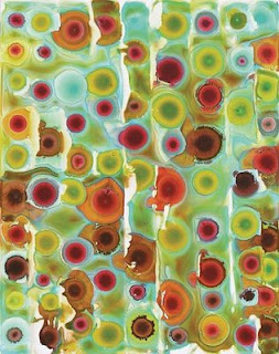
Matthew Cosby's piece "Ring Pop" is the strongest piece from his latest show at Portland's Augen Gallery . I like his use of vibrant color and shape: how each unit is a variation on hue, intensity and value, and how the black line separating each shape is reminiscent of a European cathedral's stained glass window. In addition, each work in the show carries an exactness and a level of craft which is unsurpassed . "Ring Pop" (oil on board, 19 7/8 x 18 1/2 inches)

Words to Live By

"Money is the most envied, but the least enjoyed. Health is the most enjoyed, but the least envied." — Charles Caleb Colton : (1780-1832) British clergyman, sportsman and author.

Enviga & Transparency

Image
I was struck by enviga's berry-flavored can and its use of transparency and color with while at the grocery store yesterday. I even bought one to look at and try BECAUSE of the color! I supposedly burned an extra 30 calories for my imbibing effort thanks to its green tea content. Image source: www.enviga.com

The Saturdays

Image
This UK pop group has a good handle on color. Their generally bright hues are set off by grey - a technique I find effective in highlighting hue. Additionally, the intensity absolutely matches their sound! Image source: www.myspace.com/thesaturdays

Pumpkin

Image
Here is this year's jack o'lantern! The last-minute carving project worked out well! (BTW, the design is a candelabra).

Mary Hambleton at Don Soker

Image
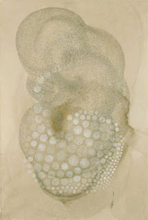
I love the subtle use of Mary Hambleton's value and texture to create this sublimely biomorphic portrait. (graphite, shellac and polymer on paper) Her other work is much more linear in theme. This particular piece seems a departure. Still, it is nicely subtle (and creepy!) Image source: Don Soker Gallery: San Francisco, CA

Optical Illusion

Image
A student of mine sent me this exciting optical illusion. Before you click on the link below to see the illusion, follow what the National Institute of Environmental Health Sciences website says to do: "If you stare at the black "+" in the center, the moving dots turns to green. Now, concentrate on the black "+" in the center of the picture. After a short period, all the pink dots will slowly disappear, and you will only see only a single green dot rotating." CLICK HERE to get the pink dots to rotate. Very cool! Image source: National Institute of Environmental Health Sciences

BLOOMING BROOCH

Image
Swirling gorgeousness defines this Chanel, white gold, blue lacquer, Paraïba tourmaline and diamond brooch. Photo by Nicolas Clerc Image source : wmagazine.com

Louis XV Chair - Dransfield & Ross

Image
I love the variegated and intense multi-colored ribbon upholstery on this Louis XV chair by Dransfield & Ross . Image source: Dransfield & Ross

Not a Paper Cup

Image
James Burgess has designed a cup meant as a fake! Made from double-walled porcelain and a silicone lid, it works well to spoof onlookers. I purchased one from the MOMA store. Although it feels a bit heavy, I look forward to it keeping my coffee warm. UPDATE: It does keep my coffee warm, but the lid smells bizarre and stains. Maybe I am the one being fooled! UPDATE #2: The cup is a nice concept, but it is no longer white. The lid is stained (from coffee & lipstick), and the cup's sides are stained from charcoal at my workplace. Image source: momastore.org

Martin Amm Photography

Image
Martin Amm's photographs of water-logged insects are divine. Image source: photo.net

Duralee Ad

Image
I love this use of color! Image source: Duralee.com

Moufelt

Image
Moufelt's designer shows at etsy.com and Relish in Portland, Oregon. Her work is a simple use of felt to create spheres or layered ovals. Image source: esty.com

Ceramics by Leah Nobilette

Image
I had the pleasure of showing my work with Leah Nobilette this past weekend at a Portland design store called Relish . I love her work thanks to its color, texture and shape. Image source: Relish

Concert Candy!

Image
I RECENTLY SAW THIS CANDY WHILE WAITING IN A GROCERY STORE CHECKOUT LINE. Questions from an inquiring mind: -Is this candy meant to be taken to and eaten at a concert? I see HM products marketed everywhere, and they are pure genius. This product is a new and fascinating genre!

John Dempcy at the Augen Gallery - downtown

Image
John Dempcy's work at the Augen Gallery (downtown location) during the month of July is a gorgeous play of color and structure. His acrylic works on panel are virtually flat, simple and complex all at once. Because I like paint and artist materials practically hanging off of the panel, I would love to see his work have an added element of physical depth. Image source: Augen Gallery: Portland, OR

Summer

Image
Although I could be outside enjoying the sun (and often am), this is often what I feel like doing in June and July: SLEEPING! Image source: real simple magazine

House Colors

Image
My house is now painted in tate olive and muted gold and red fox. The circle sizes related to the main color, trim and front door. Oddly enough, the green color makes my lawn even more vibrant! I used Miller Paint, and really liked the texture, density and finish.

Faux Food

Image
I find it difficult to choose between the oven-roasted turkey or the grilled chicken to add to my imposter food collection. Image source: incredible inedibles

Pastrami Sandwich

Image
Kenny & Zuke's pastrami sandwich looks like a delicious layered mess, and I can't wait to try one in their downtown Portland, OR location. I stumbled upon this succulent photo by pearlgirl at Neighborhood Notes - a Pearl District blog. Image source: Neighborhood Notes

Sublimely Fake - Moss Ball

Image
Macy's displays these moss balls in its crystal department. I love the combination of the natural and the artificial! Image source: amazonfoliages.com

Spring in a Picture

Image
If an image could sum up how I feel about spring, this would be it. Image source: Jean-Jaques Sempe, The New Yorker

Couturier de Cardboard Inc.

Image
Matthew Sporzynski's cut paper illustrations featured in Real Simple magazine are a visual pleasure and treasure. His company, Couturier de Cardboard Inc., designs a variety of products using cut paper. I only wish he had a website to peruse! Image source: Real Simple Magazine

Feathers

Image
Trend Alert! Now that owl and mushroom motifs are slowly making their way into obscurity (thank God!), I predict feathers to become the next "hot" motif. Image source: Bluefly.com - Joie - Penelope top

Domino Magazine Arrangements

Image
All I can say is, "Nice COLOR!" Image source: Lesley Unruh, Domino Magazine

My New Exhibition

Image
Swim Puff (relish) • 2008 • Mixed media on birch panel • 14 x 22 inches CYNTHIA MOSSER COOL PERENNIALS APRIL 30 – MAY 27, 2008 Please join me for a preview reception at the Augen gallery: Wednesday • April 30, 2008 5:30 PM – 7:30 PM First Thursday reception: Thursday • May 1st, 2008 5:30 PM – 8:30 PM AUGEN GALLERY 817 SW 2nd Avenue (downtown between SW Yamhill & Taylor Streets) Portland , OR 97204 503.224.8182 http://www.augengallery.com/calendar.html HOURS: TUESDAY – SATURDAY 10:30 AM – 5:30 PM

Unearthed Color

Image
I found an older copy of Lucky Magazine and mined this palette from the cover. Delicious.

Tropical Begonias

Image
These tropical begonia leaves and their variegated colors are fantastic, and ripe for inspiration. Image source: www.robsviolet.com/begonias.htm

Eggs

Image
I am crazy about the carefully styled pages of Martha Stewart, and this arrangement is no exception.

Mushrooms and Owls

Image
What is it with the overuse of mushrooms and owls in design-y shops like Anthropologie? Why and how do these motifs suddenly permeate the design atmosphere? Birds used to be popular, now we have these two contenders. I can't wait for their overuse and subsequent absence! Image sources (left): http://blog.kimvallee.com (right): www.superherodesigns.com

Havaianas Shoe Ad

Image
The intricate and luscious color use in the Havaianas Shoe ads are a breath of pure color. Adhemas Batista is a Brasilian designer/illustrator. Nice work!

GREAT AD - HEMA Dept. Store - Dutch

Image
HEMA is a Dutch department store. The first store opened on November 4, 1926, in Amsterdam . Now there are 150 stores all over the Netherlands HEMA also has stores in Belgium , Luxemburg, and Germany In June of this year, HEMA was sold to British investment company Lion Capital. Take a look at HEMA's product page. You can't order anything and it's in Dutch but just wait a couple of seconds and watch what happens. Don't click on any of the products pictured, just wait and see what happens. And be sure you have your sound turned up. This company has a sense of humor and a great computer programmer! CLICK BELOW: http://producten.hema.nl/

Baby Jingles

Image
Every Sunday newspaper Ashton-Drake ad seems to be a miniature newborn baby sculpture. What is it about this Baby Jingles monkey doll I find disturbing? Could it be the price of $30.00? The tongue? The hand-applied mohair? Check it out at Ashton-Drake Galleries
Image
Another image from W Magazine (my favorite fashion/art magazine) - this time by Mario Sorrenti with a Burberry dress. The use of colored lighting show the shadow to be the complement to the light source. Additionally the composition is excellent. Photo credit: Mario Sorrenti

Orange & Pink

Image
I love this whimsical and intensely hued Hermès ad in the March 2008 of W Magazine. Photo credit: Terry Tsiolis

Catalina Estrada - Masterful Color

Image
Nylon magazine displayed this ad illustrated by Spanish artist Catalina Estrada in their February 2008 issue. I applaud the artist choice as an ad for Zune Originals (a Microsoft ipod where you can pick your own design for it's back). I adore her masterful use of color and her intricate use of folk art-inspired decorative elements. If my brain could scream any more excitement about this piece, it would explode! Image: www.magnetreps.com/wp/530

Rigorous Geometry

Image
Martha Stewart's garden is truly a work of rectilinear design. Aside from the intensely organized rows of varied vegetation, the bird's eye view yields some excellent greens. Photo credit unknown www.marthastewart.com

Painting with a small brush for a long period of time...

Image
is tiring and exhilarating . (A 20/0 brush.)

Lauren Clay at Tilt Gallery

Image
These two images are pieces by Brooklyn-based sculptor Laura Clay. I spoke with her briefly and viewed her exhibit at Tilt Gallery in Portland, Oregon ( www.tiltpdx.com ). Left: "There is a Place for You, In my Heart of Hearts" 85" x 96" x 45", acrylic on cut paper, wall painting, flocking, light Right: "Seized by the Power of a Great Affection" acrylic on cut paper, plexi-glass, fabric, mixed media 40" x 85" x 80" It is not often I meet an artist whose work I like and admire SO much! Her pastel color palette, assemblage s, and shapes - both geometric and biomorphic - are simply sublime and uniquely interesting. At times the rounded strips of painted paper applied to the wall appear to be feather/wing/birdlike. I would like to purchase a piece.

Sarah Johnson at Chambers Gallery - Portland, OR

Image
This month, Sarah Johnson is showing a wall installation made from gumdrops at the Chambers Gallery. It spells out "I am not sexually satisfied". The texture, blobulous grouping and colors are what intrigue me. She is using gumdrops as text...and what a better, juicy medium for her frustrated message. After entering the gallery, I noticed the sweet smell of gumdrops (Dots) - one unexpected additional element from so many exposed candies. BTW: What are the archival qualities of gumdrops? Perhaps short-term exhibitions are her goal. If not, keeping a design on a long-term basis, resin would be a better material. No photo credit available. www.chambersgallery.org

John Currin and the Making of Art

Image
John Currin made a good point about making art when your attitude toward it (and life) changes. After meeting his (now) wife and artist Rachel Feinstein, his outlook became much more positive: "I came to the conclusion that there is no misery in art. All art is about saying yes, and all art is about its own making." Much agreed. Photograph: ELINOR CARUCCI "The New Yorker", Jan. 28, 2008, pp. 64.

Trend Alert

Image
This palette is pictured in at least three different Sunday newspaper ads. The Color Association of the United States orders us to immediately use this combination! Still, I love the brown and green. I'll link the palette to nature (i.e. moss and wood). Others I know well have named the palette "turds-n-algae".